


Project Description
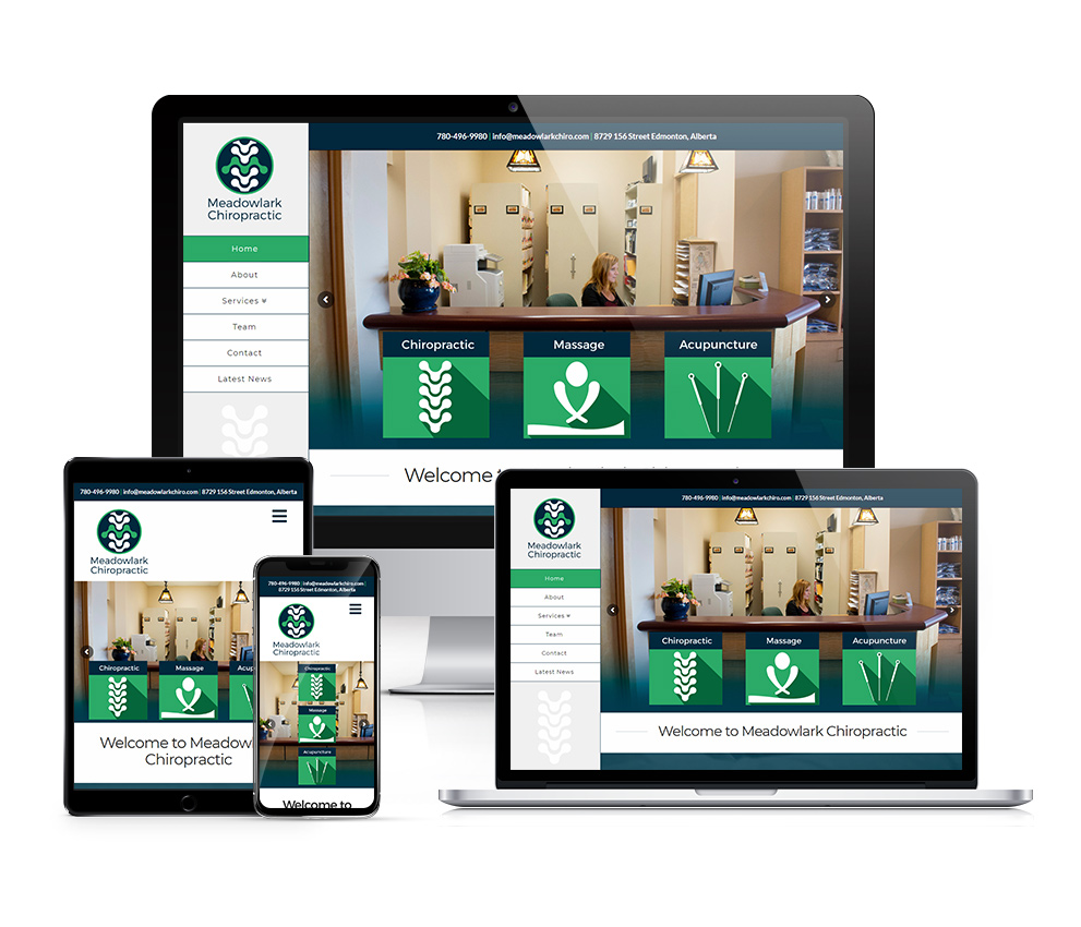
Now this was a PlanetCom web design project I could really sink my creative teeth into! It was for Meadowlark Chiropractic Clinic in Edmonton and involved a bit of everything; custom web design & development, corporate branding & visual identity, & photography.
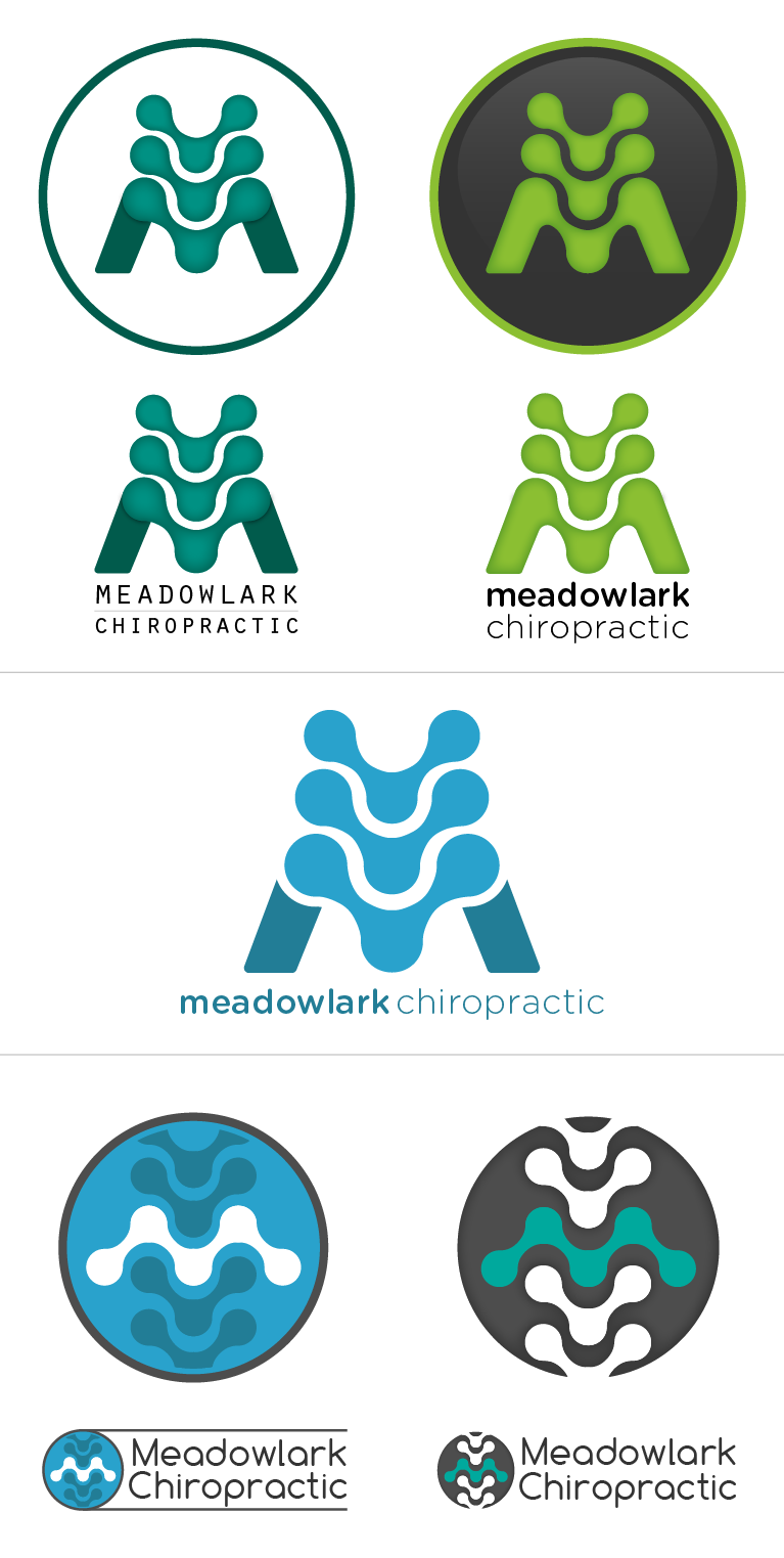
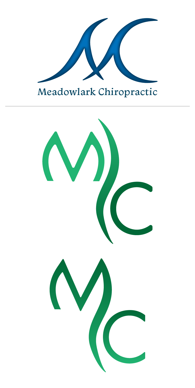
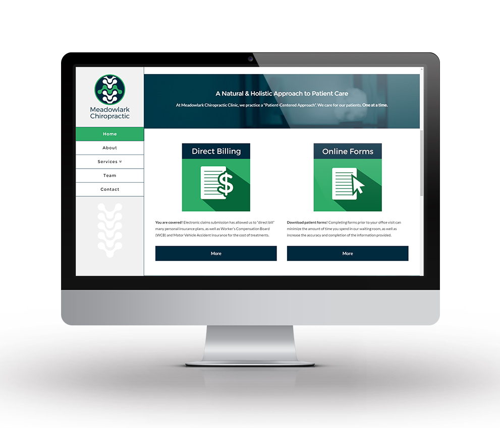
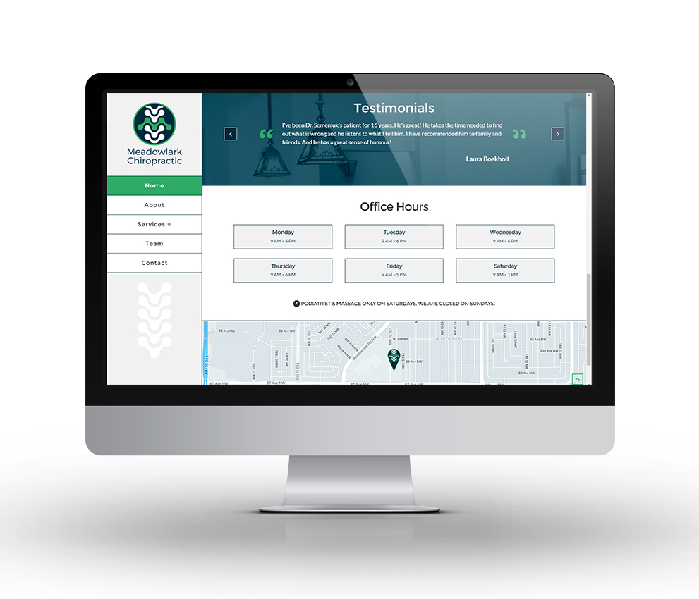
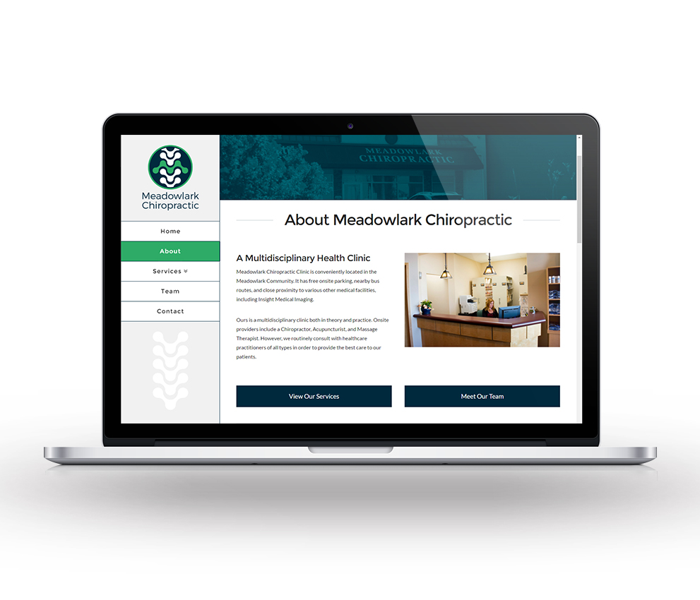
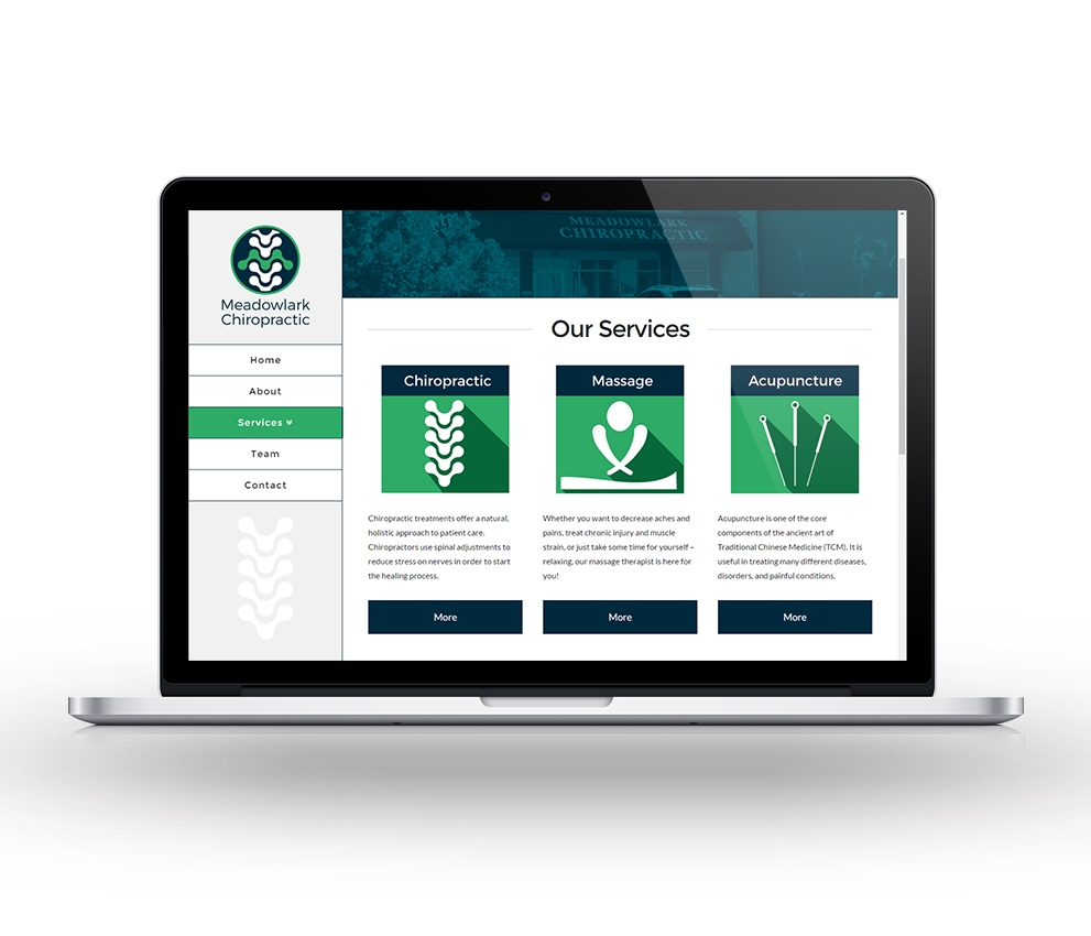
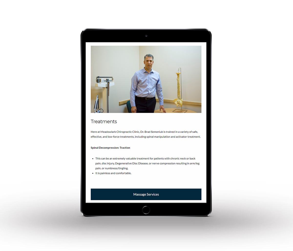
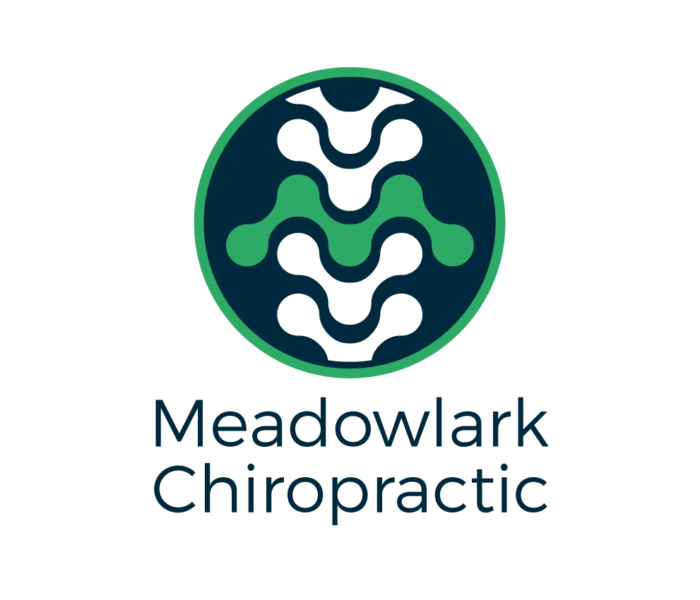
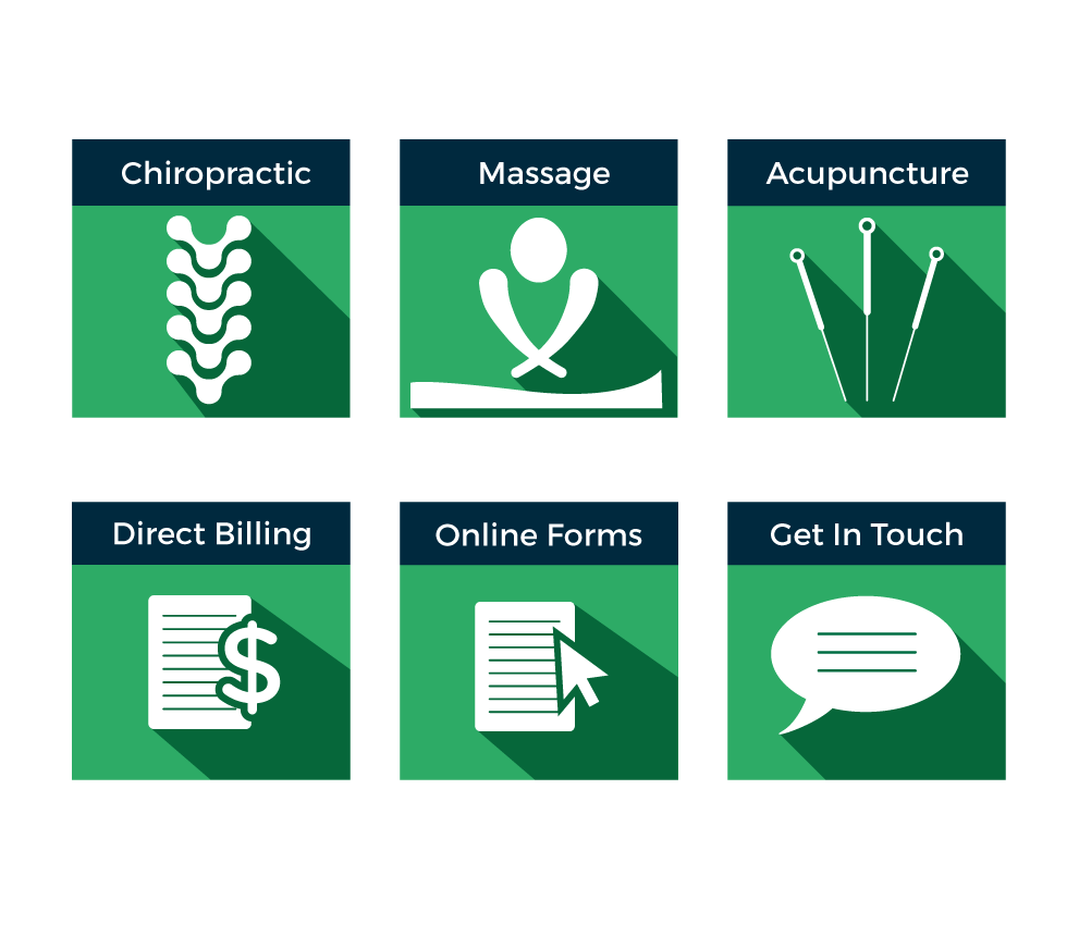
Initial meetings with the client shed light on a few ideas, but in the end it came down to a lot of research, ideation, & creative muscle flexing to come up with the finished product. The creation of some stylized spine bones ultimately led to the logo idea, which seamlessly fuses them with a similarly stylized letter "M" to subtely reveal a visual connection to both the company name, and what they do. The custom icons are flat and modern and fit right in with the new visual identity. This project also presented the opportunity to go onsite and take photos for the website. This allowed for complete creative control over the look and feel of the site and the overall user experience.
The design and functionality take full advantage of the Wordpress CMS. The layout is fully responsive and features fixed left side navigation, parallax scrolling effects, fullwidth Google Map integration, and a custom staff profile section.
Tools Used


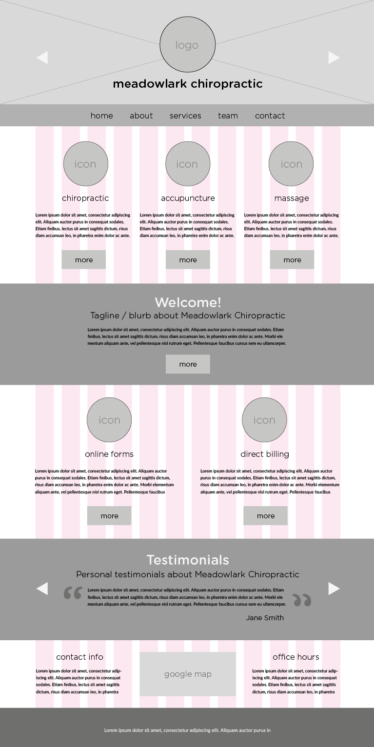
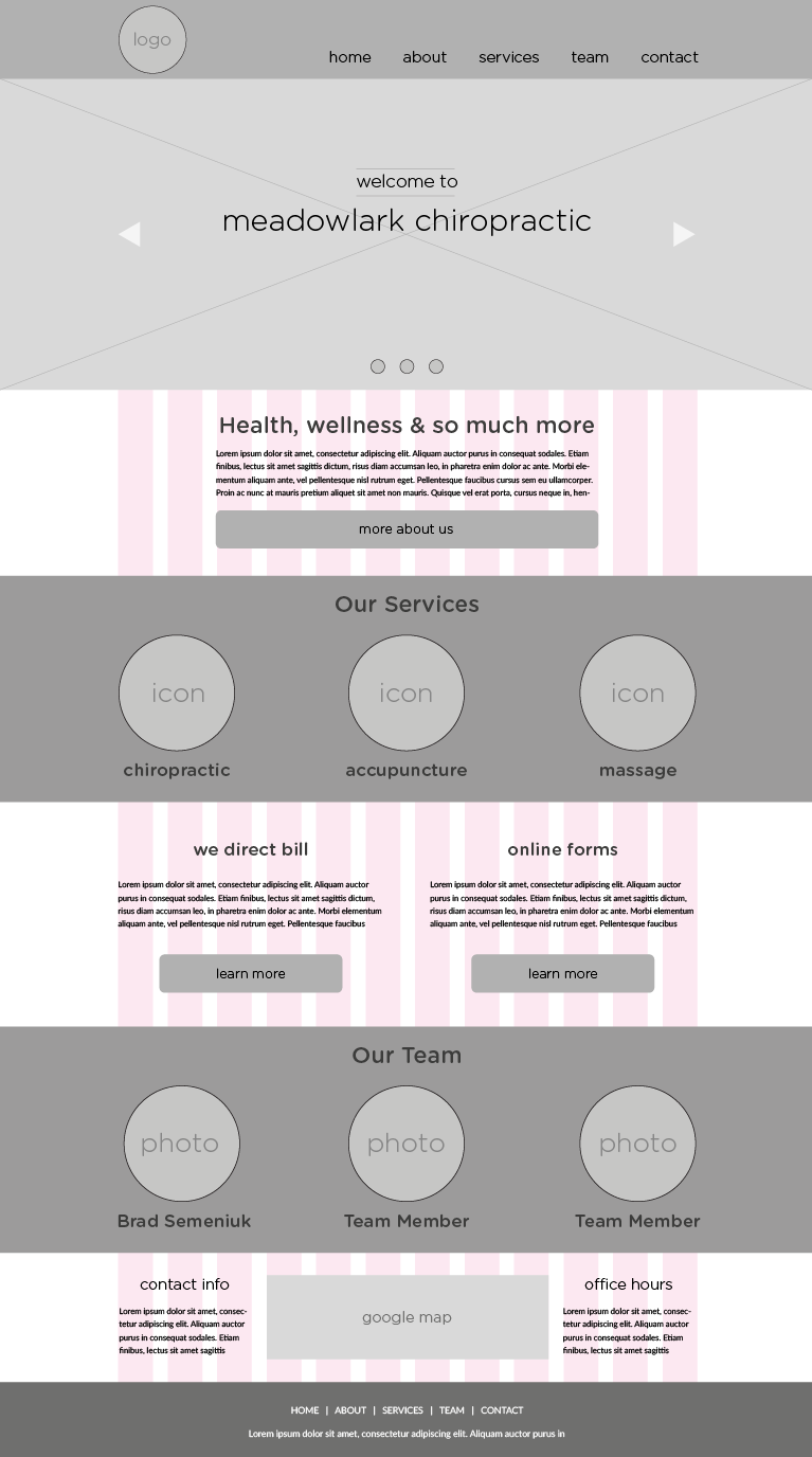
Here is what one of the preliminary homepage designs looked like in the wireframing stage. The layout is quite similar to the final design with distinct differences like circular icons and a centered, fixed menu placed at the top of the page.
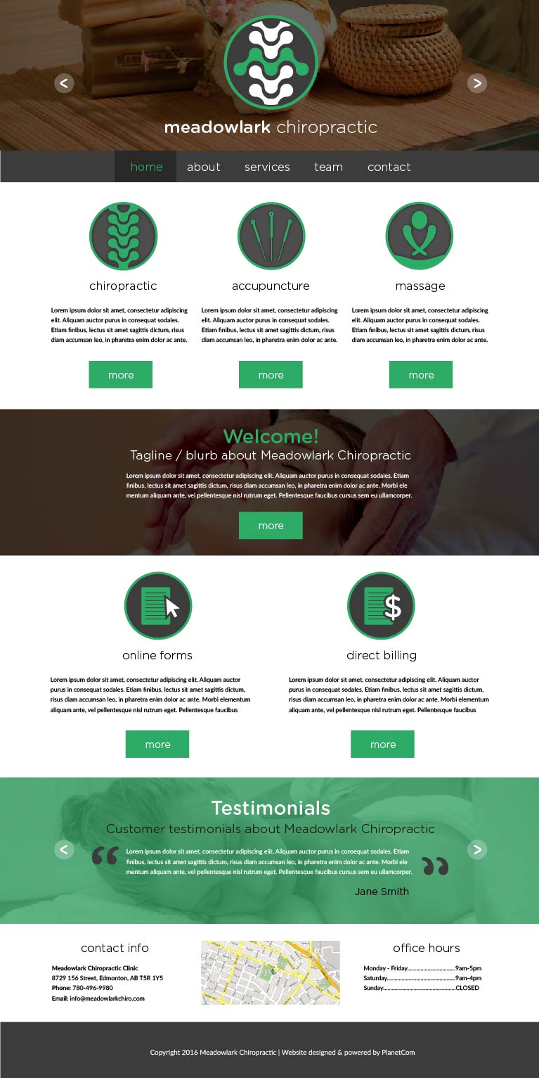
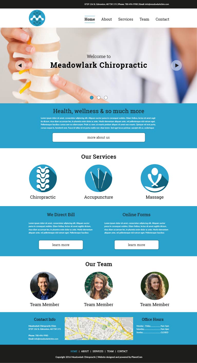
Here is the same homepage design in colour mockup form. Green and dark grey make up the colour scheme and the photos are treated with an overlay effect which adds a darker and more subtle visual experience.