
Project Description
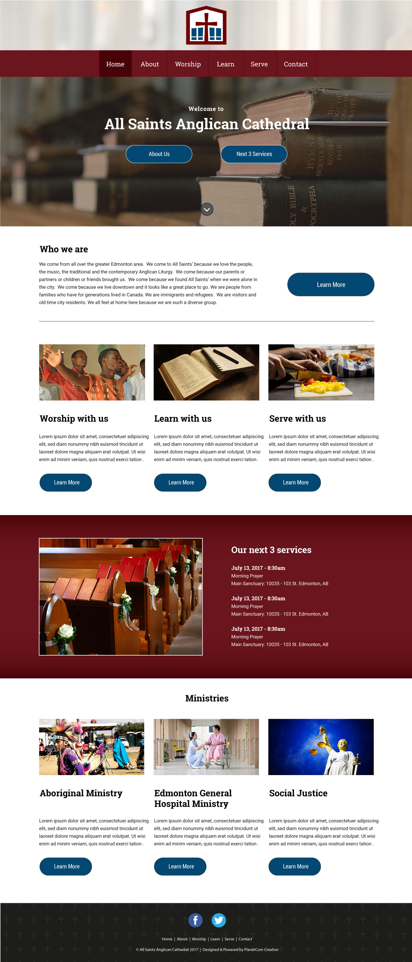
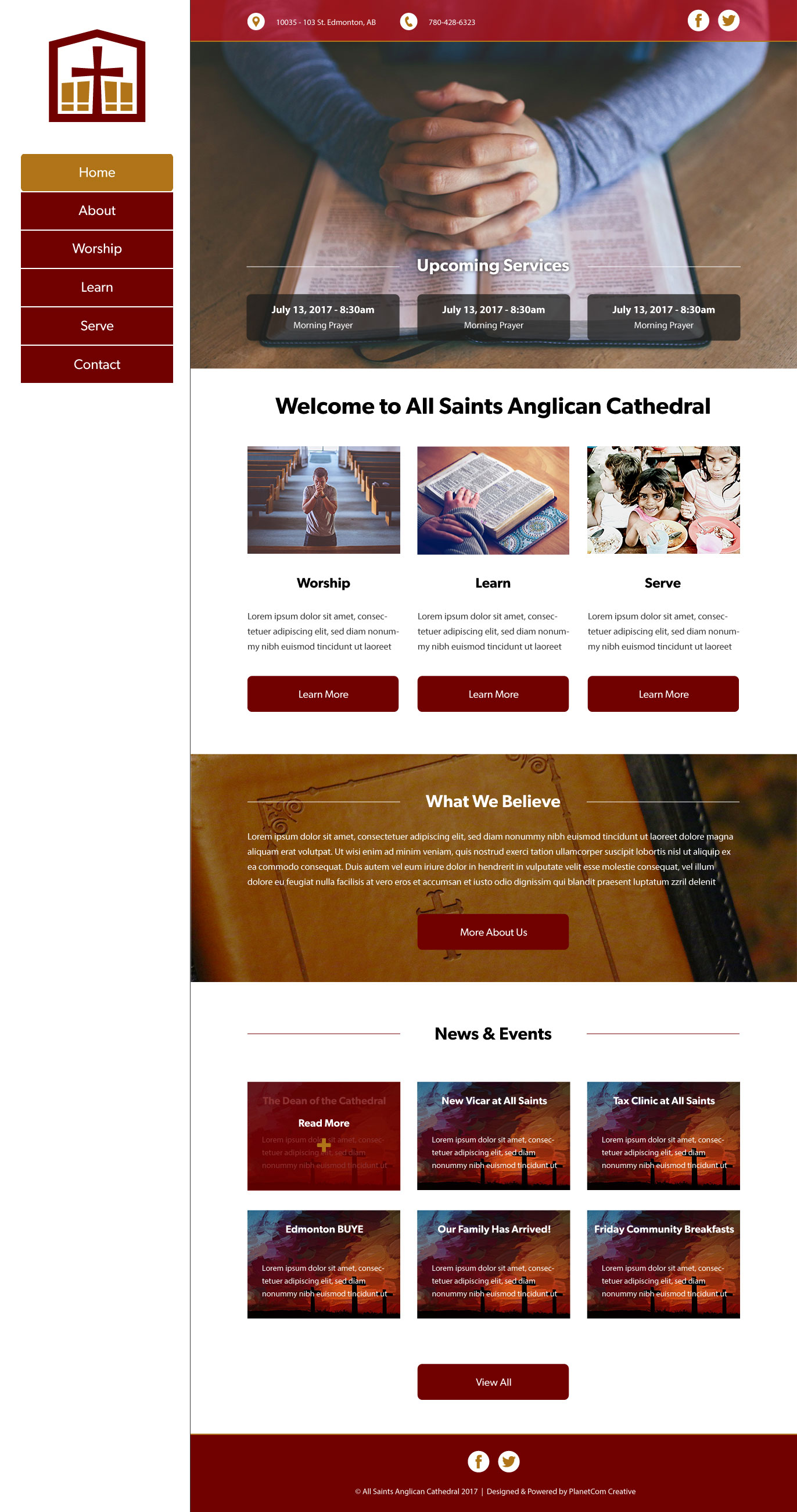
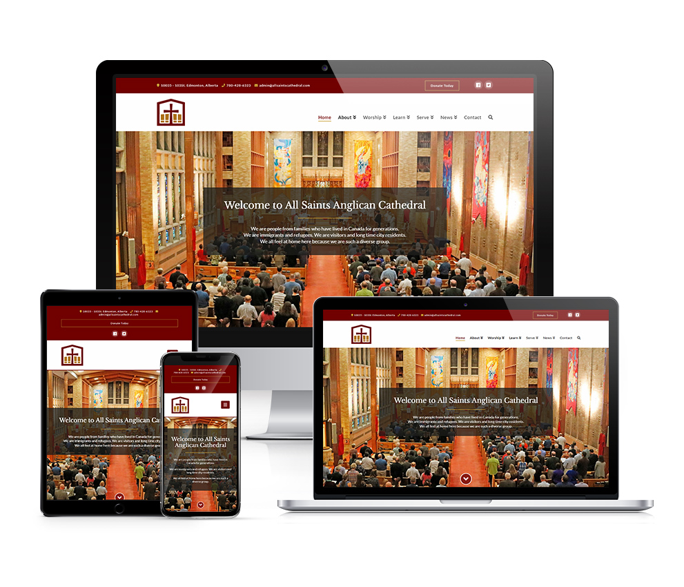
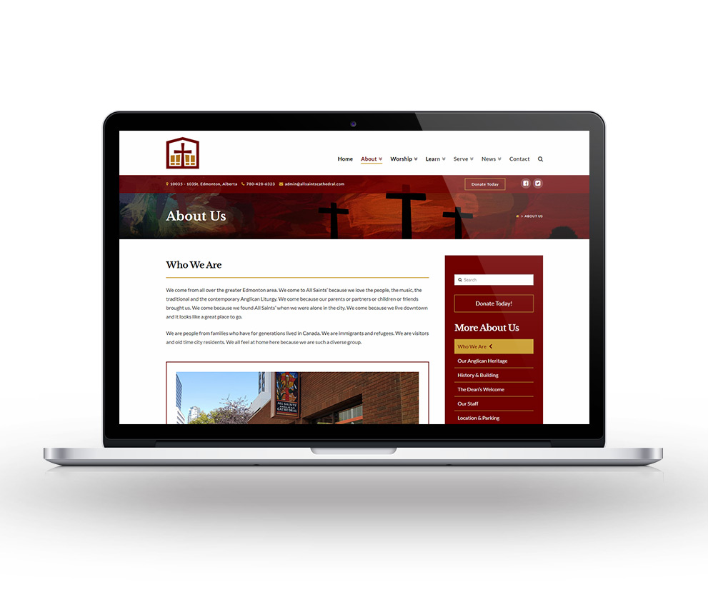
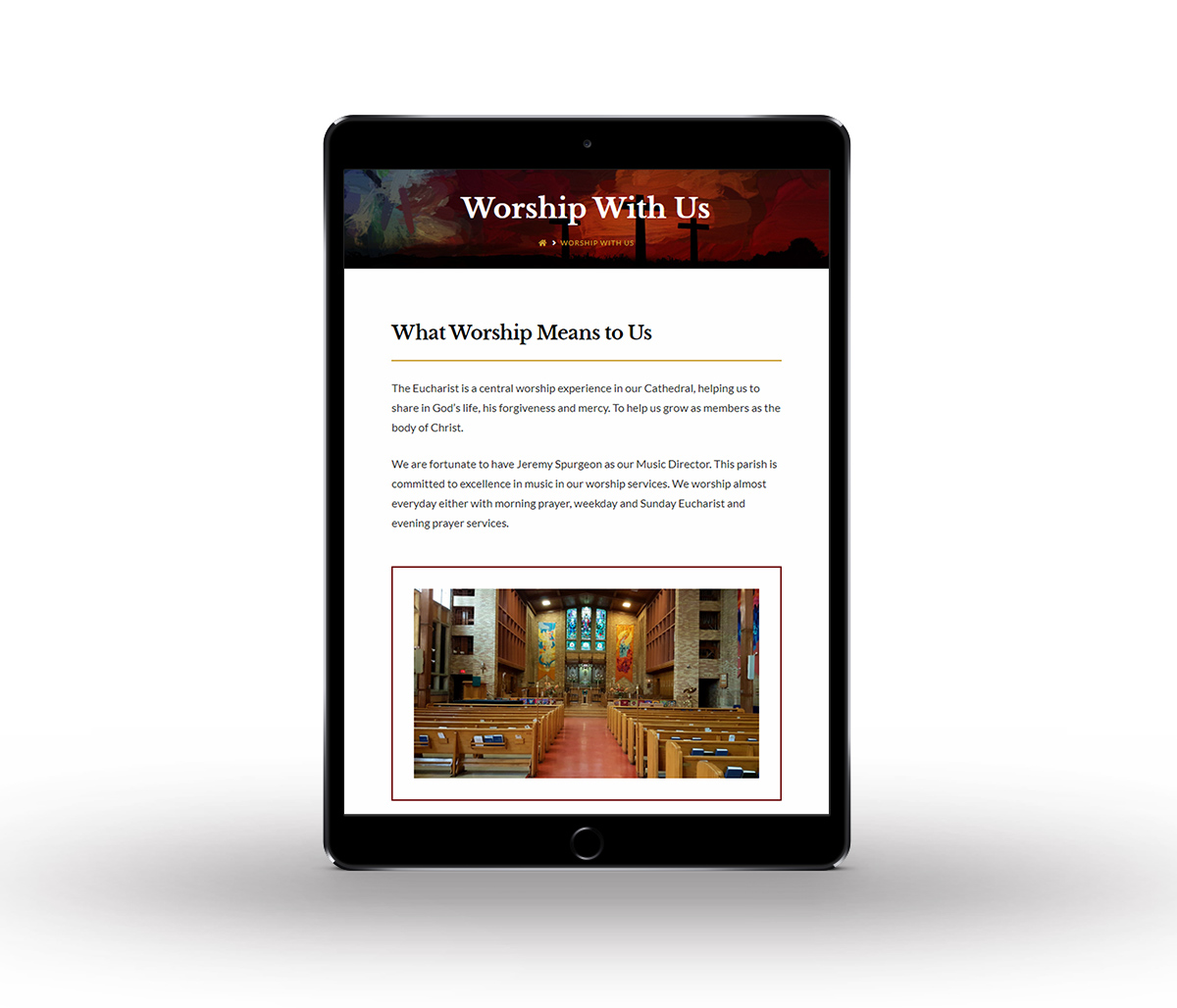
This project involved the full redesign of the website for All Saints Anglican Cathedral in Edmonton. Their old site was cluttered and designed as more of a blog-style site, which made things a bit difficult to find and navigate through. I was tasked with going through it with a fine-toothed comb and figuring out a way to organize and layout the substantial amount of pre-existing content in a way that both looks clean & modern and is intuitive to navigate.
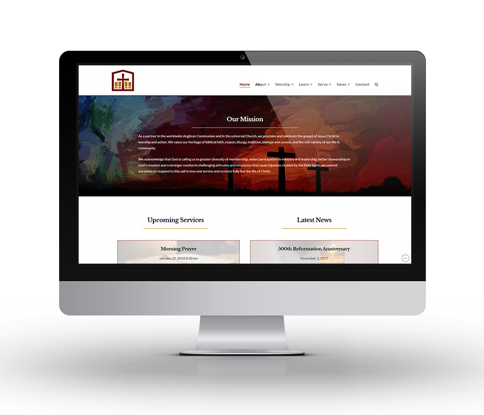
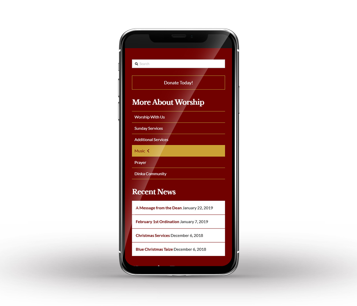
After a few design meetings with the client it was clear that they wanted the bulk of the content broken up into 3 main categories, "Worship", "Learn", and "Serve". You will see these displayed prominently on the homepage to easily access each section. The colour red was also found to be an important aesthetic symbol for the church and their beliefs, so the logo and highlight colours on the site were changed to reflect this.
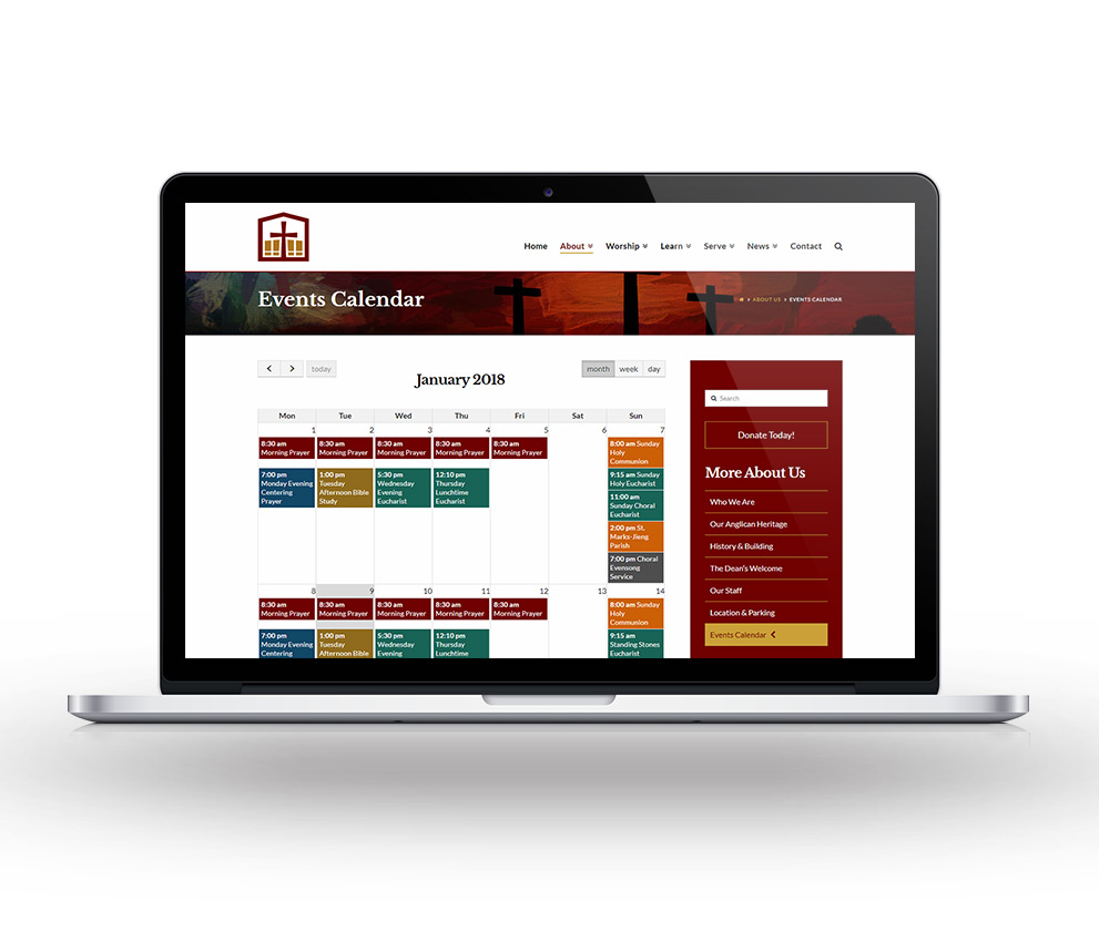
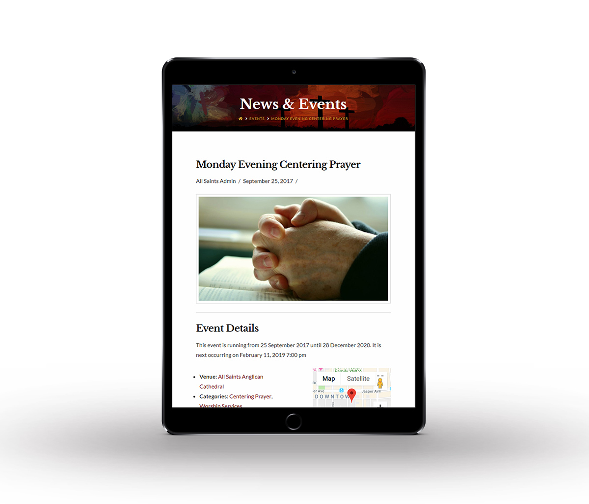
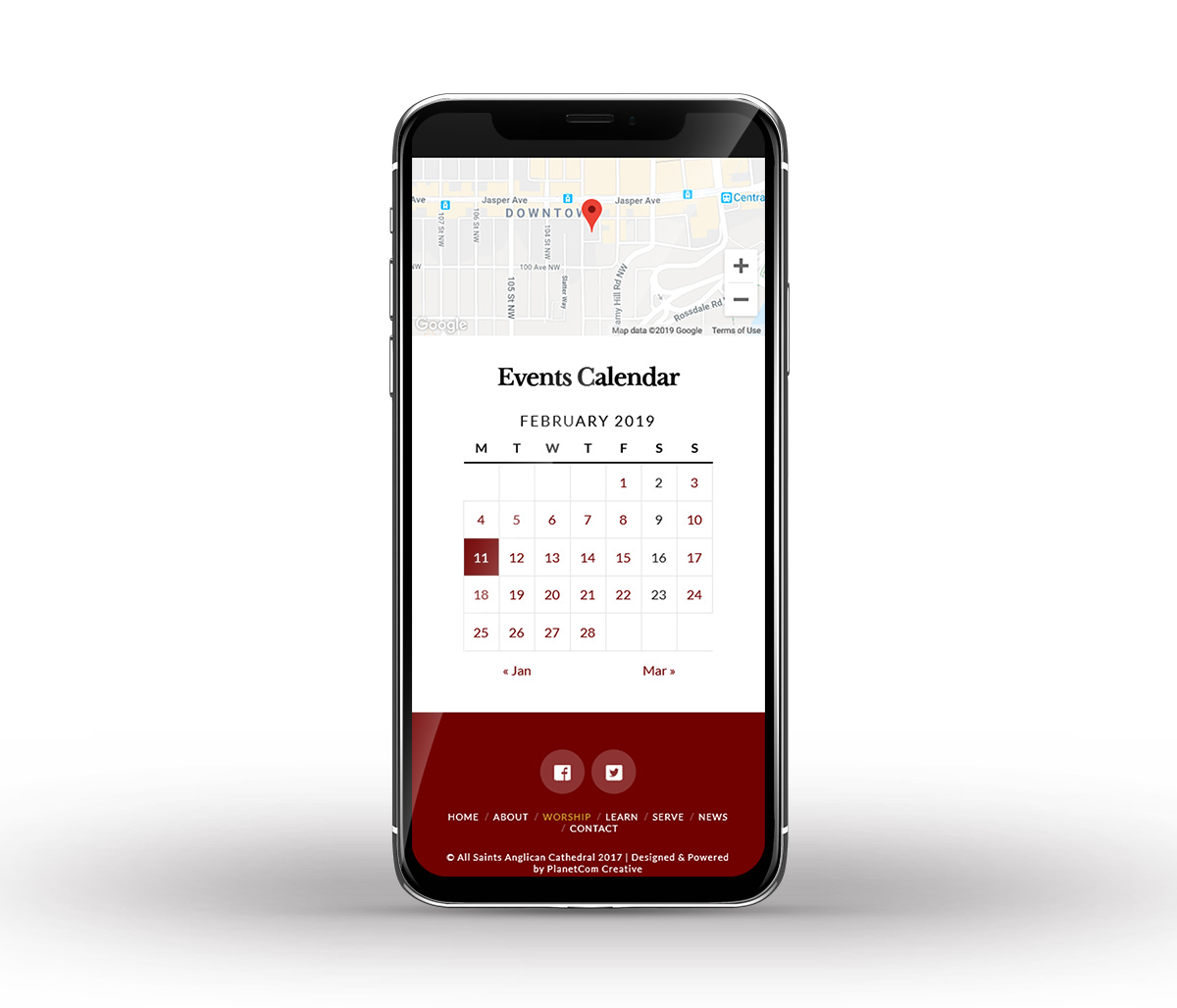
The design and functionality take full advantage of the Wordpress CMS and includes features such as a dynamic news feed & events calendar, fixed top navigation bar, and Google Map integration.
Tools Used